Why Measurement Is the Missing Link in Most DEI Strategies
I've spent decades working alongside organizations that genuinely want to build more diverse, equitable, and inclusive workplaces. The intention is rarely the problem. What I see fail — consistently, predictably, and expensively — is the measurement. Organizations invest in training, hire consultants, launch employee resource groups, and publish bold commitments. Then, twelve months later, they pull together a handful of headcount numbers, present them at an all-hands meeting, and call it accountability.
That's not accountability. That's a report card with half the grades missing.
In Diversity & Inclusion: The Big Six Formula for Success, I introduced the D&I Dashboard as a core operational tool — not a communications artifact, but a living management instrument that drives decisions, surfaces inequities, and connects inclusion work to business outcomes. In The Inclusion Solution, I expanded on that framework to show how the right metrics don't just measure inclusion — they create it, because what gets measured gets managed, and what gets managed gets resourced.
This article is about building a DEI dashboard that actually works. Not one that looks impressive in a slide deck, but one that holds leadership accountable, tells the full story of your workforce experience, and connects your inclusion investments to the outcomes your organization exists to produce.
Why Most DEI Metrics Fail
Before we build something better, we have to be honest about why the current approaches aren't working. In my experience, DEI measurement fails for three predictable reasons.
The Vanity Metrics Trap
The most common mistake I see is organizations measuring what's easy to count rather than what actually matters. Total headcount by race and gender is the DEI equivalent of measuring website traffic without looking at conversions. It tells you something, but not enough. When the entire DEI report is built on representation numbers at the organizational level, you're looking at a snapshot of who walked in the door — not whether they're thriving, advancing, or planning to stay.
Vanity metrics create a false sense of progress. An organization can show improved representation numbers while simultaneously having a culture where employees from underrepresented groups feel isolated, overlooked for promotion, and underpaid relative to peers. The numbers look good. The experience is broken.
Annual-Only Reporting Cycles
DEI reported once a year is DEI managed once a year. If your organization only examines inclusion data during an annual review cycle, you lose the ability to course-correct in real time. You miss the moment when a particular team's inclusion scores drop after a leadership change. You miss the quarter when promotion rates for women of color fall below parity. By the time the annual report surfaces these patterns, the damage is done and the talent may already be gone.
Effective DEI measurement requires the same cadence discipline we apply to financial performance. You wouldn't manage your budget with one annual review. Don't manage your people strategy that way either.
Aggregated Data That Hides the Truth
Perhaps the most dangerous measurement failure is the lack of disaggregated data. When you report "people of color" as a single category, you obscure wildly different experiences. When you report "women" without examining intersections of race, disability status, or career level, you miss the specific inequities that require specific interventions. I call this the aggregation illusion — the data looks balanced at the surface while deep inequities persist in the layers beneath.
Real accountability requires disaggregated, intersectional data. It requires the courage to look at what the numbers reveal when you break them apart.
The DEI Measurement Framework: Four Tiers That Tell the Whole Story
The framework I recommend organizes DEI metrics into four progressive tiers: Representation → Experience → Advancement → Impact. Each tier builds on the one before it, and together they create a complete picture of how inclusion is functioning — or failing — inside your organization.
Think of it as a diagnostic system. Tier 1 tells you who is in the building. Tier 2 tells you how they feel once they're there. Tier 3 tells you where they're going. Tier 4 tells you what it all means for the organization's future.
Tier 1 — Representation Metrics: Who Is in the Room?
Representation is the foundation. It's necessary but not sufficient. The goal at this tier is to move beyond simple headcount to a nuanced picture of workforce composition.
Key Metrics at Tier 1
- Workforce demographics by level: Don't just measure overall representation — measure it at every organizational level from entry-level through the C-suite and board. The gap between representation at hire and representation in leadership is one of the most telling numbers in your entire dashboard.
- Pipeline diversity: Track applicant demographics, interview slate composition, and offer acceptance rates by demographic group. Where in the pipeline are you losing diverse talent? That answer shapes your intervention strategy.
- Intersectional analysis: Report data by the intersection of race, gender, disability status, and veteran status at minimum. A woman may be well-represented in your workforce overall while women of color are concentrated in lower-level roles. You won't see that without intersectional disaggregation.
- Retention rates by demographic group: Representation isn't just about who you hire — it's about who stays. Differential retention rates are an early warning system for cultural and equity problems.
One organization I worked with discovered that while their overall gender representation was nearly equal, women were leaving at twice the rate of men within the first three years of employment. The representation numbers looked fine. The retention data told a very different story — and it led directly to a redesign of their early-career development programs.
Tier 2 — Experience Metrics: How Does It Feel to Work Here?
Representation without belonging is a revolving door. Tier 2 measures the qualitative reality of the workplace — whether employees from all backgrounds feel seen, valued, and safe to contribute fully.
Key Metrics at Tier 2
- Belonging and inclusion index scores: Deploy validated survey instruments that measure sense of belonging, perceived fairness, and inclusion in decision-making. These scores should be reported by demographic group, department, and level — not just as an enterprise average.
- Psychological safety measures: Adapted from the foundational research of Amy Edmondson, psychological safety scores tell you whether employees feel safe to speak up, take risks, and bring their authentic selves to work. Low psychological safety is a direct tax on innovation and performance.
- Manager inclusion behaviors: Survey data should capture how employees experience their direct managers on inclusion-specific dimensions — do they solicit diverse perspectives, address bias when they see it, advocate for team members equitably?
- Exit interview disaggregation: When people leave, ask why — and analyze those reasons by demographic group. Exit data is some of the most honest data you'll ever collect.
In The Inclusion Solution, I emphasize that inclusion is not a feeling — it's a set of behaviors and systems that either enable or prevent full participation. Tier 2 metrics give you the behavioral and perceptual evidence to make that case with data.
Tier 3 — Advancement Metrics: Who Is Moving Forward?
This is where equity becomes most visible — and most consequential. Advancement metrics examine whether opportunity is distributed equitably across your workforce.
Key Metrics at Tier 3
- Promotion parity ratios: For every demographic group, calculate the ratio of their promotion rate to the overall promotion rate. A ratio below 1.0 indicates that group is being promoted at a lower rate than average. Ratios significantly below 1.0 demand immediate investigation.
- Pay equity analysis: Conduct regular, rigorous pay equity analyses that control for role, level, tenure, and performance — then examine whether unexplained gaps remain by race, gender, or their intersection. Unadjusted pay gaps tell one story; adjusted gaps tell another. You need both.
- Sponsorship and high-visibility assignment access: Track who is being nominated for stretch assignments, leadership development programs, and executive sponsorship. These informal advancement mechanisms often drive career trajectories more than formal promotions — and they are frequently distributed inequitably.
- Performance rating distribution: Examine whether performance ratings are distributed equitably across demographic groups at the same level. Systematic differences in performance ratings are a significant equity risk and a source of downstream pay and promotion gaps.
Tier 4 — Impact Metrics: What Is Inclusion Producing?
This is the tier that transforms DEI from a cost center to a value driver — and it's the tier most organizations never reach. In Diversity & Inclusion: The Big Six Formula for Success, I connect inclusion directly to marketplace growth, workforce excellence, and community engagement. Tier 4 metrics make that connection explicit and measurable.
Key Metrics at Tier 4
- Innovation indices: Track the demographic diversity of teams generating patents, new product ideas, or process improvements. Research consistently shows that diverse teams produce more innovative solutions — your data should confirm or challenge that pattern in your own organization.
- Market expansion metrics: Measure the correlation between workforce diversity and your organization's ability to reach, serve, and retain diverse customer and client segments. Diverse teams understand diverse markets. That understanding has revenue implications.
- Supplier diversity spend: Track the percentage of procurement dollars flowing to minority-owned, women-owned, and veteran-owned businesses. This is both an impact metric and a community investment measure.
- Community investment ROI: If your organization invests in community programs, workforce development pipelines, or educational partnerships, measure the return — both in talent pipeline outcomes and in brand equity within diverse communities.
- Employee Net Promoter Score by demographic group: Would your employees recommend your organization as a great place to work? The gap between eNPS scores across demographic groups is a powerful composite indicator of inclusion effectiveness.
Building the Dashboard: Architecture, Data Sources, and Visualization
A framework is only as powerful as its implementation. Here's how to build a dashboard that actually gets used.
Data Sources and Integration
Your dashboard will draw from multiple systems: your HRIS for demographic and compensation data, your performance management system for ratings and promotion data, your engagement survey platform for experience metrics, and your financial and operational systems for impact data. The goal is integration — a single view that connects these data streams into a coherent narrative.
Refresh Cadences
- Monthly: Representation snapshots, pipeline metrics, retention alerts
- Quarterly: Promotion parity ratios, pay equity indicators, experience survey pulse data
- Annually: Comprehensive pay equity analysis, full inclusion index survey, impact metrics review, year-over-year trend analysis
Sample Dashboard Layout
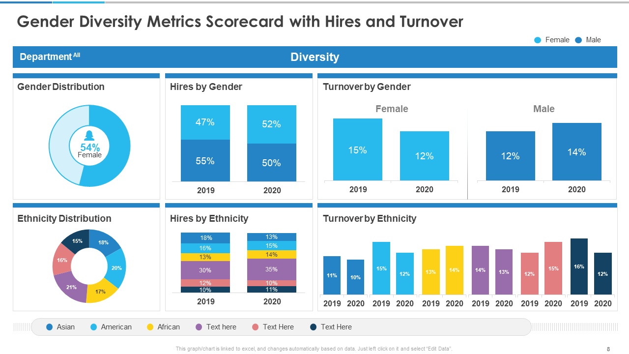
An effective DEI dashboard for executive reporting should be organized into four visible panels corresponding to the four tiers, with each panel displaying three to five headline metrics, trend indicators showing movement from the prior period, and demographic breakdowns accessible one click deeper. A fifth panel should display the organization's stated DEI goals alongside current performance, making the gap between aspiration and reality visible at a glance. Color-coding should follow a simple logic: green for on-track, yellow for watch, red for action required — with clear ownership assigned to every red indicator.
Visualization Best Practices
Use ratio and index visualizations rather than raw counts wherever possible — they make disparities visible regardless of group size. Funnel charts work exceptionally well for pipeline analysis. Heat maps by department and level surface pockets of inequity that enterprise averages conceal. Always show trend lines, not just point-in-time snapshots.
Accountability Mechanisms: Connecting Metrics to Consequences
Data without accountability is just information. The organizations that drive real change are the ones that connect DEI metrics to leadership performance management.
Leadership KPIs
Every senior leader should have two to three DEI-specific KPIs embedded in their annual performance objectives — and those KPIs should carry real weight in compensation and advancement decisions. These aren't checkbox items. They are business performance indicators. Leaders who consistently show strong inclusion metrics on their teams should be recognized and rewarded. Leaders whose teams show persistent equity gaps need coaching, support, and clear expectations for improvement.
Board Reporting
The board of directors should receive a DEI dashboard summary at least quarterly. Board-level visibility signals organizational seriousness and creates healthy accountability for the C-suite. I've seen board engagement transform the urgency of DEI work at the executive level faster than almost any other intervention.
Transparent Communication
Share your data — including the uncomfortable parts — with your workforce. Organizations that publish honest, disaggregated DEI data internally build more trust than organizations that only share the highlights. Transparency communicates respect. It says: we trust you with the truth, and we're committed to doing better together.
Implementation Timeline
- Months 1–2: Audit existing data sources, identify gaps, establish baseline metrics across all four tiers
- Months 3–4: Design dashboard architecture, select visualization tools, assign data ownership and refresh responsibilities
- Month 5: Launch pilot dashboard with senior leadership team, gather feedback, refine
- Month 6: Full rollout, establish board reporting cadence, integrate DEI KPIs into leadership performance management cycle
- Months 7–12: First full operating cycle, quarterly reviews, year-end comprehensive analysis and goal-setting for the following year
What Rigorous Measurement Makes Possible
I've watched organizations transform their outcomes when they committed to this level of measurement discipline. One professional services firm used promotion parity analysis to discover that Black professionals were being rated equitably in performance reviews but nominated for advancement at significantly lower rates — a sponsorship gap, not a performance gap. That single insight led to a structured sponsorship program that produced measurable advancement gains within eighteen months.
A healthcare organization used their Tier 2 belonging data, disaggregated by department, to identify two clinical units with dramatically lower inclusion scores among nurses of color. Those scores correlated with higher turnover in those units — and with patient satisfaction scores. Connecting the dots between inclusion, retention, and patient outcomes made the business case for intervention undeniable.
These outcomes don't happen by accident. They happen because someone decided to measure what matters, look honestly at what the data revealed, and hold leadership accountable for acting on it.
In Where Is Your Why?, I write about the importance of building your personal plan around what truly matters — not what's comfortable or convenient. The same principle applies to organizational measurement. Build your DEI dashboard around what actually drives equity and inclusion, not around what's easiest to report.
The D&I Dashboard isn't a communications tool. It's a management tool. When it's built with rigor, populated with honest data, reviewed with regularity, and connected to real accountability, it becomes one of the most powerful levers you have for building the kind of organization where every person can contribute fully — and where that full contribution drives results that matter to everyone.
That's not just good DEI practice. That's good leadership.